 When chromaticity shift is quantified in an LM80 report it is done with reference to the CIE 1976 diagram.
The colour shift is presented as the change to the position of the observed colour on the horizontal (u) and vertical (v) axes. On the graph below, from a typical LM80 report these are summed and presented on the vertical axis as DELTA u’v’.
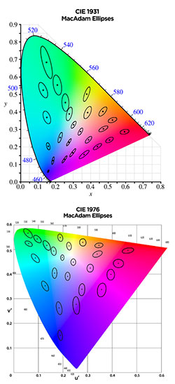
The CIE 1976 diagram is always used because it corrects the chief deficiency of the CIE 1931 diagram. The CIE 1931 diagram is not suitable for measuring chromaticity shift because it is not scaled to the way the human eye works. The easiest way to see this is to compare McAdam ellipses on the CIE1931 diagram with the same elipses on the CIE1976 diagram.
A McAdam ellipse describes an area on a colour chart inside which the average human eye can discern no colour difference – the colour at the top, bottom, left or right of the elipse appears to be the same. Compare the two charts shown here – on the 1931 chart the ellipses are of different sizes in different areas of the chart. If the CIE1931 colour space diagram was a map, then its scale would vary from one side to the other and from top to bottom – not very useful if one is trying to measure the distance on the ground between two points.
For this reason the CIE developed a new colour space diagram in 1976. Notice that the McAdam ellipses are now of almost identical size right across the diagram. This is a “colour map” with a consistent scale that can usefully be used to measure the distance, in colour terms, that a light source has shifted over time.